
Since Syncfusion’ launch of the new Bold BI® Cloud dashboard solution three months ago, we have been working on fulfilling some highly demanded features, such as for widgets and data sources. Now, it’s time to reveal them. We are excited to announce our latest update to Bold BI Cloud rolled out today.
Feature summary
This release update comes with a remarkable set of new features and improvements:
- Map widget enhancements
- New KPI Card and Combo Chart widgets
- Color customization improvements
- Forecasting support
- Usability improvement in Smartsheet data connection
Map widget enhancements
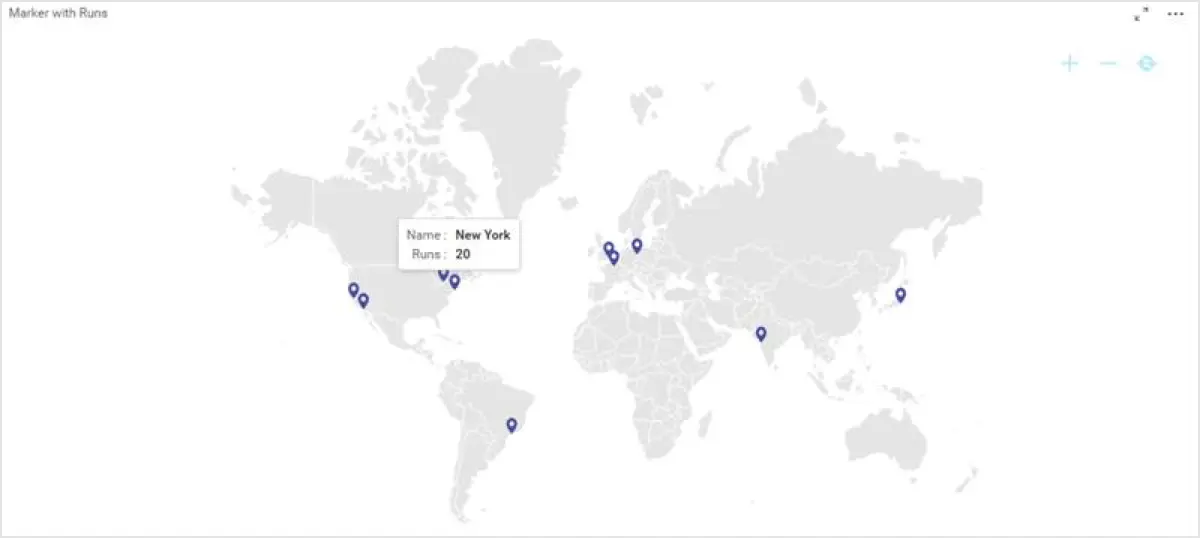
Bubble maps and choropleth maps are now available as one map in the toolbox, with property settings added to switch between these types.
Users can also configure tooltips for any data column(s) whose value needs to be displayed.
Bind the latitude and longitude data columns as locations in maps that are highlighted by markers enabled by default.
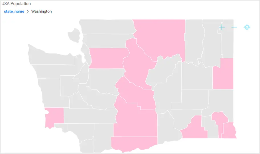
Map regions can be drilled down to next level in the hierarchy. For example, continent -> country -> state/counties. Currently, this will work for all continent maps until country level, for U.S. and India maps until state and county levels.
Map data is available for the following countries: Belgium, Finland, Denmark, Ireland, Italy, Japan, New Zealand, Norway, Republic of Korea, South Africa, Spain, Sweden, Austria, Brazil, Greece, Hong Kong, Israel, Singapore, Switzerland, and all states of India.
New widgets
KPI Card is a new widget replacing the existing card widget in the toolbox. This widget is preferable when there is a need to compare actual and target values. You can configure the tile image and background image as either static images or through an image-bound data column. Also, there are sparkline and customizing options, such as font size and color, that can be enabled for each of the elements.


Combo Chart is another new widget allowing you to configure measure values in two different axes (primary and secondary y-axis). You can change each of the measures’ chart types to some other relevant chart type.
Color customization improvements
Now you can bind colors to widget elements bound with one metric based on another metric.
Distinguish values that lie within a range better through gradient coloring. Also, rule-based conditional formatting now supports a percentage-value type.
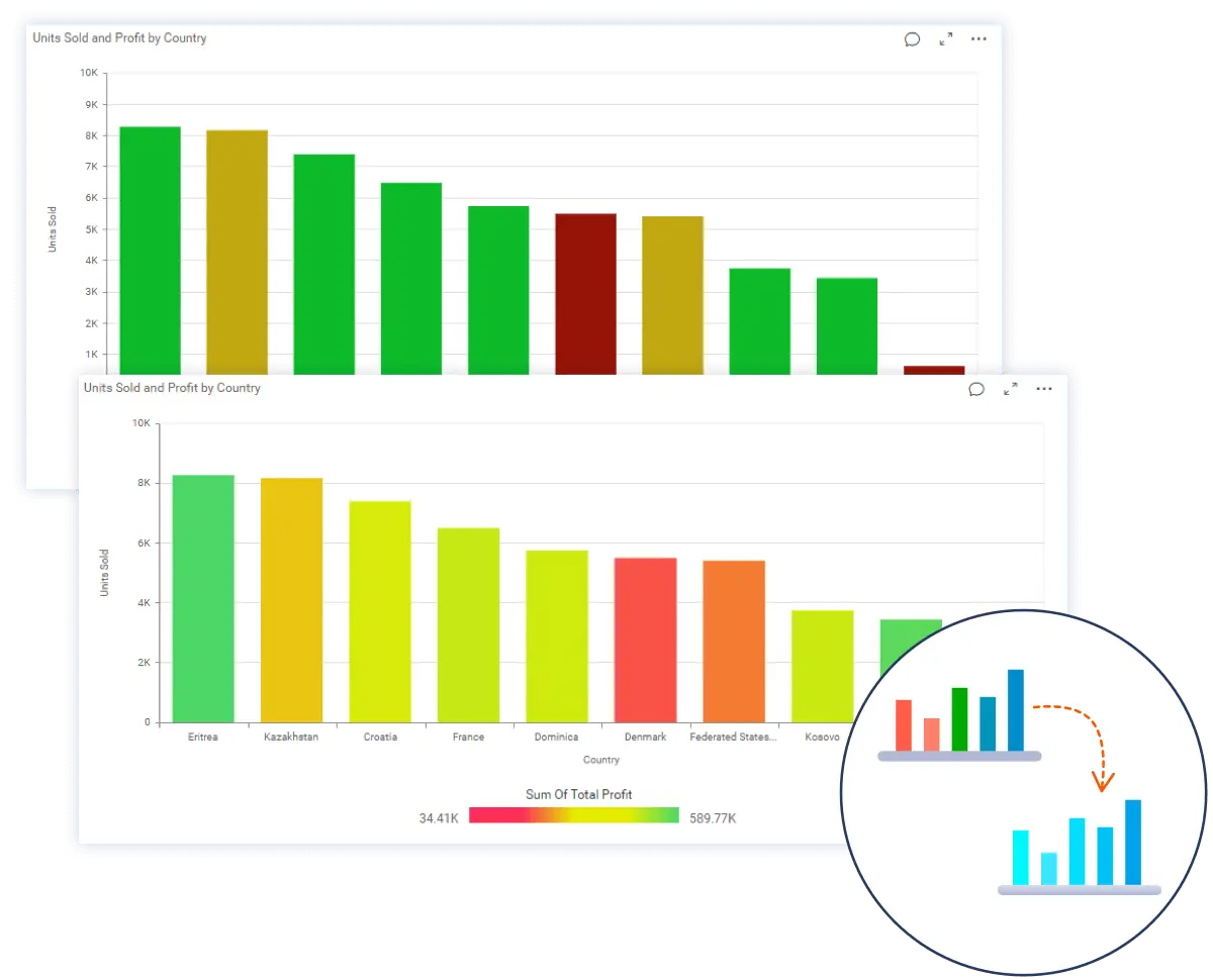
Define each category in a tree map with individual colors.
Conditionally display different icons as part of a column value in a grid widget.
In general, most of the color customization options differ based on the widgets.
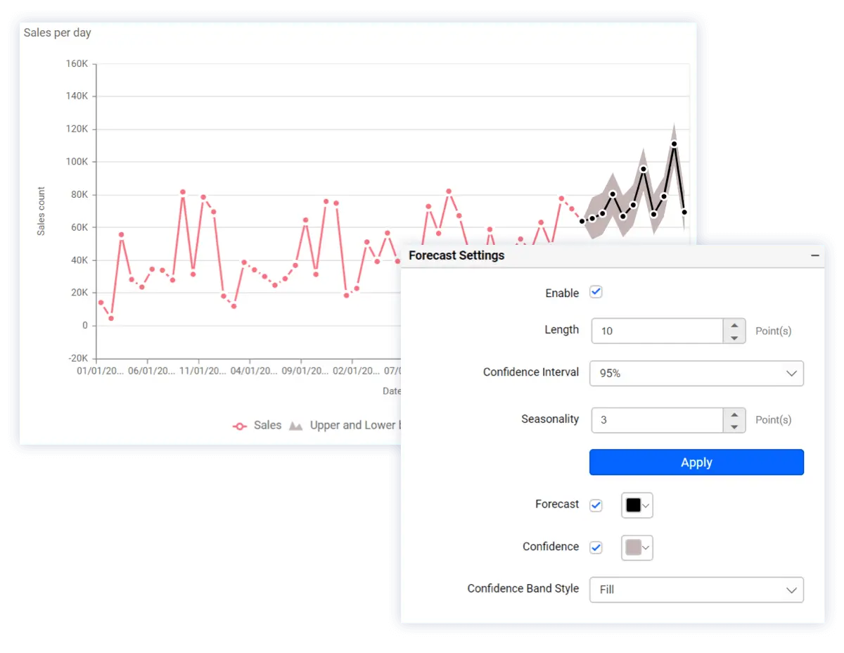
Forecasting with time-series data
Forecasting time-series data using an exponential smoothing technique is now supported in line and spline charts.
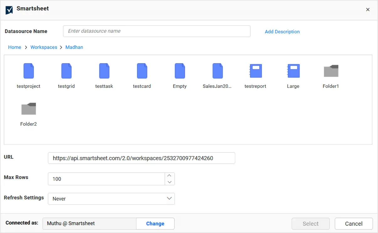
Usability improvement in Smartsheet connector
Now frame the URL endpoint automatically by navigating to the required report or sheet in Smartsheet using a new file browser wizard.
Conclusion
This blog article gives you a brief summary on each of the feature included in this update.
Now, Bold BI® offers solutions for the Oil and Gas and Pharmaceutical industries, too. Get started with Bold BI by signing up for a free trial and create more interactive business intelligence dashboards. Bold BI also offers enterprise and embedded dashboard solutions. Read this blog post for more detail.
If you have any questions or need clarification, please use the comments section available below. You can also contact us by submitting your questions on the Bold BI contact page, or if you already have an account, you can log in to submit your support question.