


In this first update (v2.8.14) since its launch in August 2019, Bold BI® Enterprise has expanded with a rich set of features and improvements. Also, this update puts the Enterprise version on equal footing with the features supported in the Cloud version. In this blog post, we will briefly discuss the new features and enhancements included in this update of Bold BI Enterprise.
Key features
Dashboard Designer enhancements
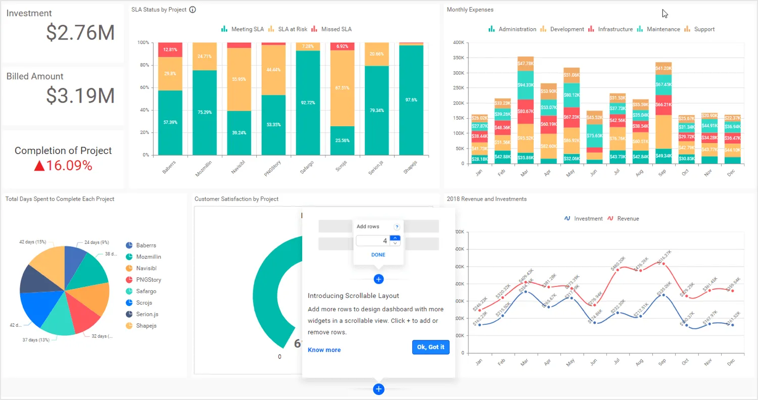
Add more rows in the dashboard layout to hold more widgets
Add more rows in your dashboard layout to accommodate more widgets. Then, view the entire dashboard dynamically through scrolling mode.
Improved loading performance
Initial rendering of dashboard has been improved 2x times faster than before.
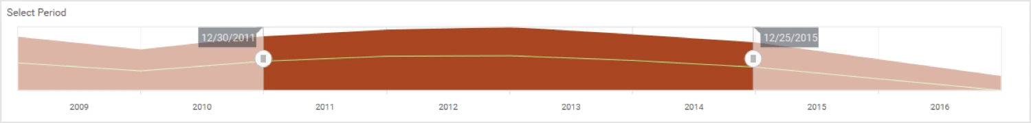
Synchronize data extracts with the latest updates through advanced refresh settings
You can synchronize extract-mode-type data sources with the latest updates through advanced refresh settings such as recurring time interval, recurring type (hourly, daily, weekly, monthly, yearly), and refresh start and end dates.
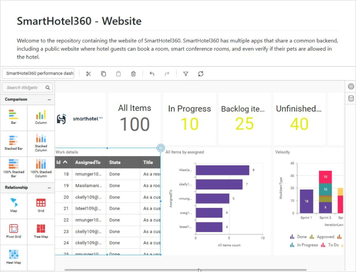
Embed dashboard and data source designers with less effort
Embed Bold BI dashboard and data source designers in your application with just a URL in an iframe. This doesn’t require any complex development or code knowledge.
Dynamic binding of data sources
Connecting a dashboard to different data sources of the same schema can be configured through the embedded URL API endpoints hosted in an application.
New API endpoints for dashboard views
REST API endpoints have been introduced to manage (retrieve, add, update, and delete) dashboard views.
New sample dashboards in demo gallery
Sample dashboards for the retail industry and human resources departments have been added:
- Retail Stores Performance Dashboard
- Retail Inventory Management Dashboard
- HR Recruitment Dashboard
- Workforce Performance Dashboard
Data source enhancements
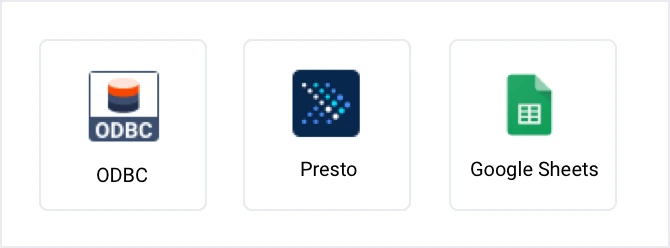
New data connectors
Connect Presto, ODBC, and Google Sheets data sources through new built-in connectors.
Background paging for REST-based web data
Paging is now supported for some REST-based web data sources, enabling fetch for up to 10,000 records in background.
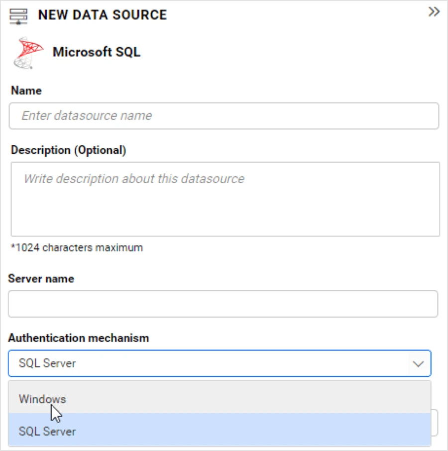
Windows authentication in Microsoft SQL
The Microsoft SQL connector now supports Windows authentication too.
Widget enhancements
New widgets available
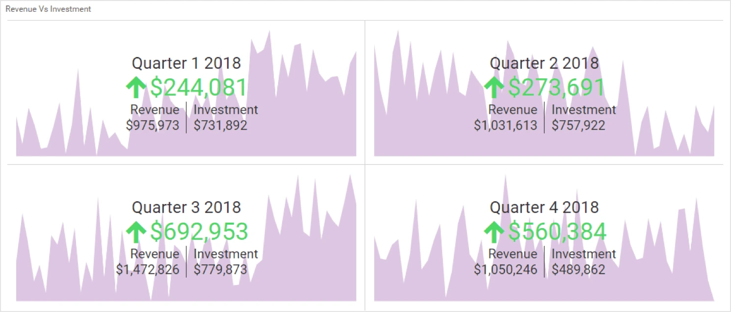
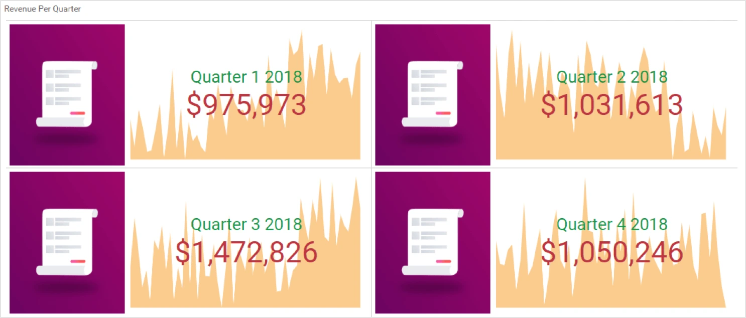
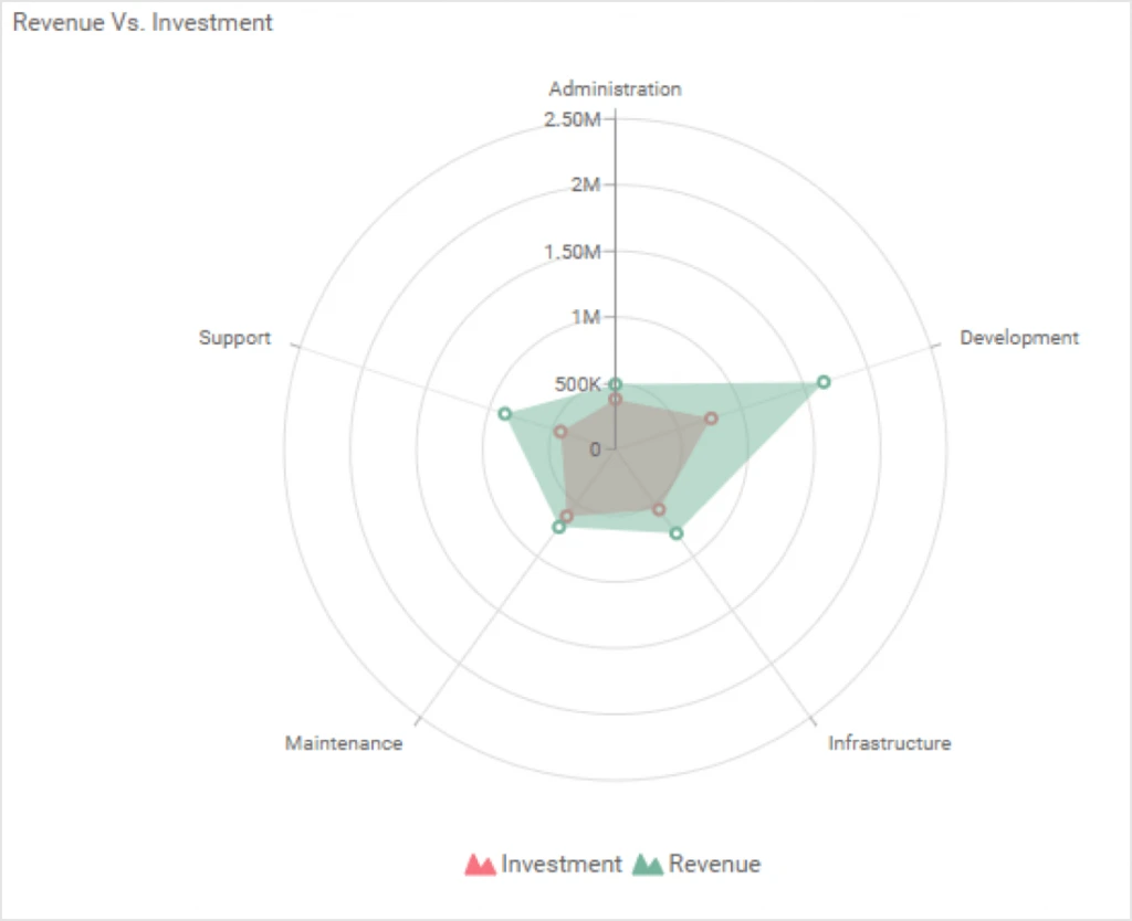
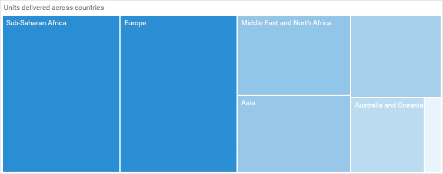
Four new widgets have been added to the Dashboard Designer toolbox. The card widget has been split into two based on functional aspects: KPI card and number card. The other two new widgets are radar polar chart and range navigator.
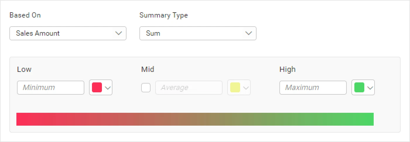
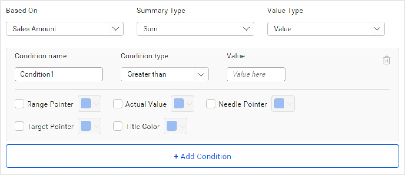
Color customization options
Customize radial gauge elements like the range pointer, actual value, needle pointer, target pointer, and title color based on conditional formatting.
Customize pivot grid header colors and grouping panel background.
Apply the monochromatic color in map, tree map, and heat map widgets.
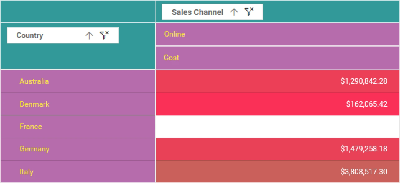
Use conditional formatting in map markers.
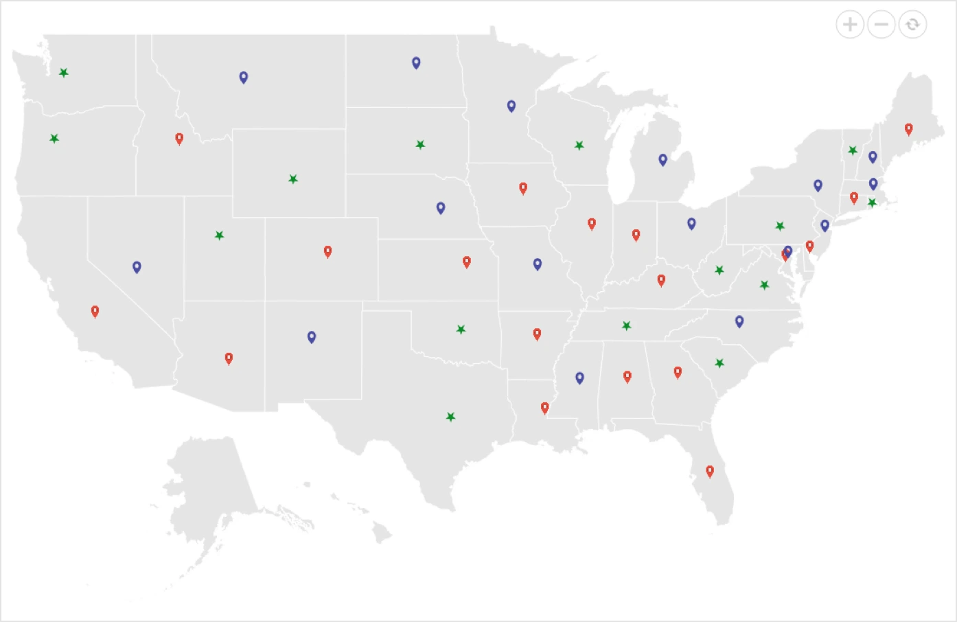
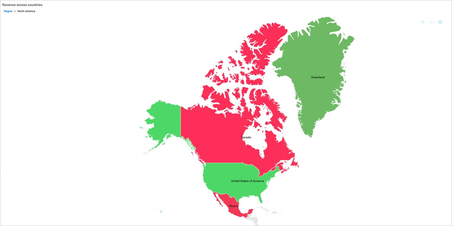
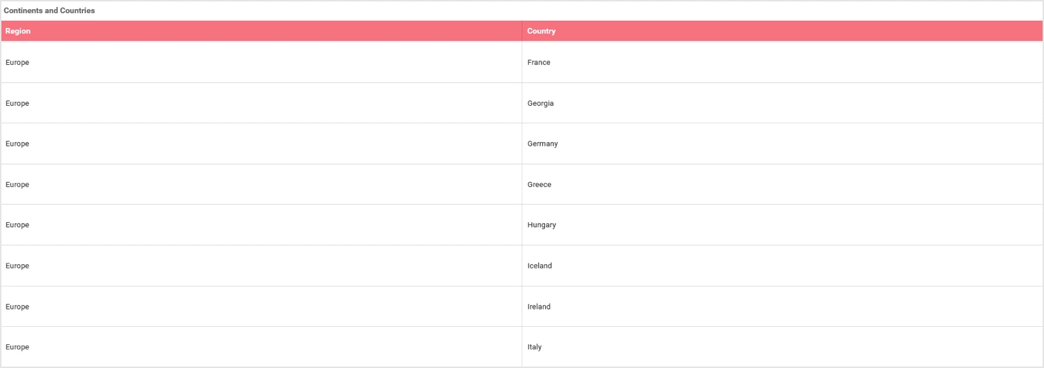
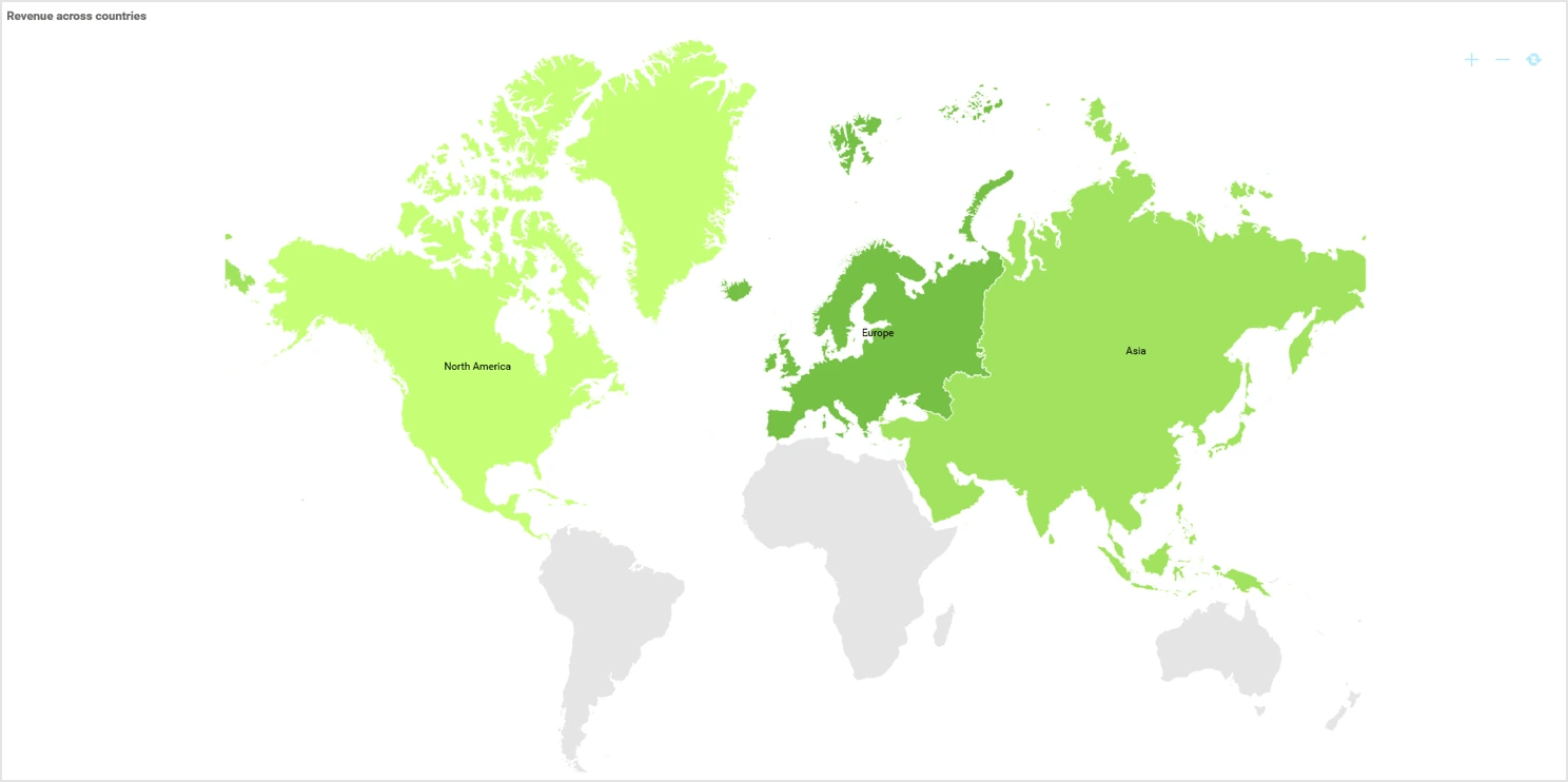
Drill down in Map widget
Drill down in map regions to successive levels in a hierarchy. For example, continent > country > state/counties.
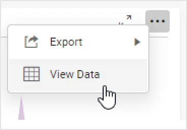
View underlying data
Visualize the raw data associated with a widget at runtime.
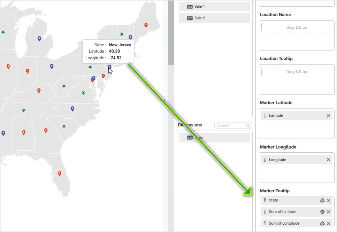
Tooltip customization
Customize tooltip display items through column configuration across all chart and map widgets. Also for maps, configure tooltips for latitude and longitude markers. By default, the maps widget doesn’t have tooltips configured.
Other improvements
You can now define row height in the grid widget explicitly.
You can also display labels over map regions.
Conclusion
We hope this article reveals new features and improvements you’re excited about in Bold BI® Enterprise v2.8. Get started with Bold BI by signing up for a free trial and create more interactive business intelligence dashboards.
If you have any questions or need clarification, please use the comments section available below. You can also contact us by submitting your questions on the Bold BI contact page, or if you already have an account, you can log in to submit your support question.


