


In today’s data-driven landscape, businesses seek effective tools for displaying information. One such tool is funnel chart visualization, specifically designed to depict decreasing proportions of an original number as stages in a process. This tool aids in problem diagnosis and process improvement across industries. This blog will explore funnel charts’ functionality, applications, and benefits.
Understanding funnel charts
Funnel charts are valuable for understanding process stages. They provide a clear and simple visual representation of how quantities change through each phase.
Why funnel charts matter
Funnel charts are an effective tool for visualizing the progression of components through a process that filters out or loses some of those components. Visualizing sales data with funnel charts matters in the following ways:
- Understanding conversion rates: Funnel charts are excellent for visualizing conversion rates at each stage of a process. They help identify at which stage in a sale potential customers drop off or where the process may be failing to retain interest.
- Identifying bottlenecks: By visualizing the flow of a process, funnel charts make it easier to spot stages where there is a significant reduction in volume, indicating potential bottlenecks that need to be addressed.
- Optimizing processes: By analyzing the data represented in a funnel chart, organizations can focus their efforts on improving the stages with the most significant customer drop-offs, thereby optimizing the overall process and increasing throughput.
- Comparative analysis: Rendering multiple funnel charts allows for a comparison between different cohorts, time periods, or other variables. This can help determine the effectiveness of changes made to the process or compare the performance of different teams or products.
- Visual simplicity: Funnel charts provide a straightforward visual representation that is easy to understand, making them an effective communication tool for sharing insights with stakeholders who may not be familiar with more complex statistical analyses.
- Facilitating training and onboarding: For new team members, funnel charts can serve as educational tools that provide a clear picture of a process flow and expected outcomes.
When to use funnel charts
Funnel charts excel at visualizing stage-based processes with decreasing quantities. They are useful in scenarios when you are:
- Showcasing a sequential process or flow with stages.
- Analyzing conversion rates in sales pipelines.
- Highlighting the stages of a customer journey.
- Illustrating recruitment or hiring processes.
- Understanding lead qualification and progression.
- Visualizing drop-offs or diminishing values across stages.
- Tracking the stages of a project or task completion
When not to use a funnel chart for visualizing your data
While funnel charts are effective in various scenarios, there are situations where they might not be the most suitable choice for data visualization:
- When data doesn’t involve a sequential or narrowing progression.
- In situations where the stages don’t exhibit a clear decrease or drop-off.
- When the information doesn’t follow a distinct flow.
- If the data points are not measurable or quantifiable.
- In cases where the stages don’t have a significant impact or relevance.
- If the focus is on displaying equal or fluctuating values rather than a funneling process.
- If the purpose is to compare individual, unrelated data points rather than a sequential process.
How to configure data in a funnel chart using Bold BI
To configure data for a funnel chart in Bold BI®, follow these steps:
- Connect the data source that contains the information you want to visualize in the funnel chart.
- Drag and drop the funnel chart widget onto your dashboard canvas.
- Navigate to the Assign Data tab. Drag the dimension field into the Category section and the value field into the Value section.
- Configure the sorting order of the dimension data to reflect the actual flow of the funnel.
- Adjust the funnel chart settings to match your visual preferences, such as the colors, labels, and tooltips.
- Lastly, update the title and all the relevant basic settings under the Properties tab.
Check out this link for more details.
Real-time use cases of funnel charts
Funnel charts serve as versatile tools across industries, providing insights into processes that help leaders optimize workflows and enhance overall performance. Following are examples of funnel charts.
1. Sales:
a. Sales pipelines
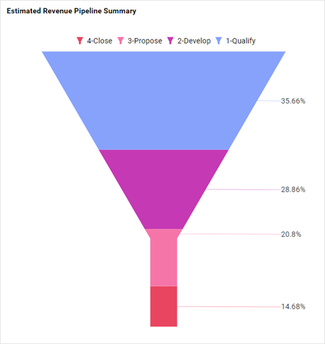
This funnel chart presents the stages of a sales process from initial contact to closing a deal, visualizing the number of opportunities at each stage. It is important to visualize this data to identify bottlenecks in the sales process and to forecast revenue based on the progression of deals through the pipeline.
b. Deals by stage
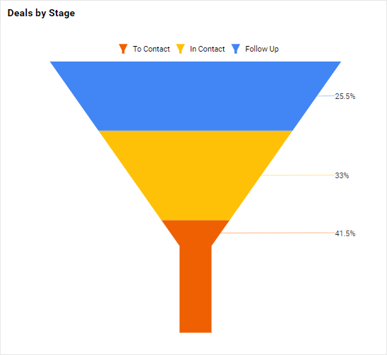
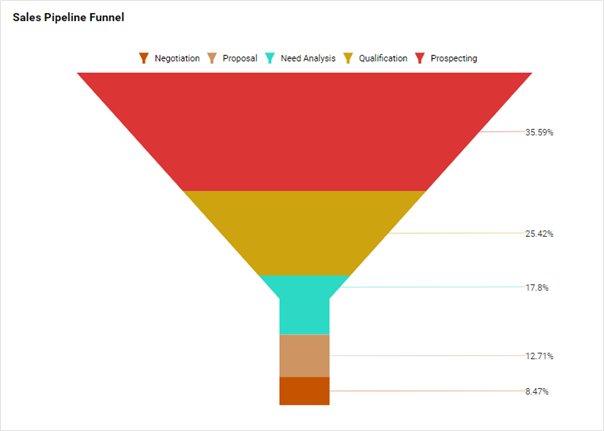
This funnel chart shows the percentage of sales opportunities in each stage of the sales cycle. Utilizing a funnel chart to visualize this data is important for sales managers to understand the flow of potential deals through different stages.
c. Opportunities by stage
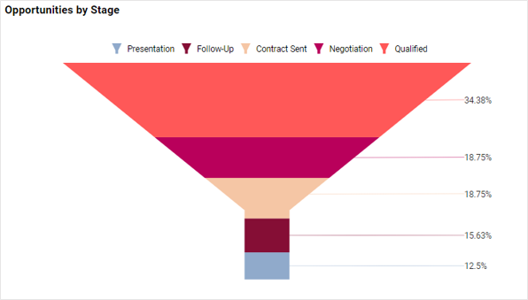
Opportunities by stage is a key metric for tracking potential deals throughout the sales process. It helps sales teams monitor where prospects are in the pipeline and spot stages requiring improvement. A funnel chart visualization is crucial for seeing how opportunities decrease at each stage, identifying bottlenecks, and forecasting revenue by analyzing volume and conversion rates.
2. HR department:
a. Recruitment processes
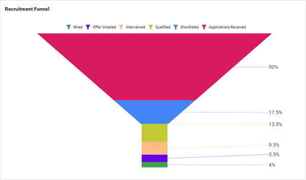
This metric illustrates the stages of hiring, from receiving applications to finalizing hires, and tracks the number of candidates at each stage. Visualizing this data through a funnel chart is important for HR teams to identify inefficiencies in the recruitment pipeline and to ensure a smooth and timely hiring process.
How to use a funnel chart to visualize your data
Using a funnel chart to visualize your data involves understanding the nature of your data and the story you want to tell. Consider the following when designing your chart:
- Define your process stages.
- Determine the sequence of stages.
- Consider the size of your dataset.
- Assess if percentages or absolute values are more important.
- Ensure readability.
- Decide if you need to display conversion rates.
In conclusion, mastering funnel charts lets individuals and businesses uncover hidden patterns, identify bottlenecks, and optimize processes. Their simplicity and effectiveness in conveying complex data make them a common tool in the realm of visual analytics, offering a gateway to actionable insights.


