


Businesses can struggle to accurately convey complicated data, which leads to misunderstandings. Stacked bar charts are one good option for data display, allowing businesses to compare portions to totals on the dataset and glean significant insights for strategic planning. This blog will provide you with a complete grasp of stacked bar charts.
Define a stacked bar chart
A stacked bar chart is a graph in which each bar is divided into many segments to indicate the distribution of various categories or subgroups within a greater total. It enables the easy comparison of individual parts to the total across different categories, resulting in a clear comprehension of the data’s composition and relative proportions.
Benefits of using stacked bar charts
Segmentation of data: Stacked bar charts divide a bar into segments to show how various groups contribute to the total, allowing for easy comparison of each category’s impact.
Comparison: They enable segment comparison across categories, like sales in various regions or product lines over time.
Space efficiency: Stacked bars efficiently display large amounts of data within confined spaces, ideal for space-constrained dashboards or reports.
Versatility: Stacked bar charts are versatile, suitable for categorical and rank-order data, and ideal for diverse business data analysis.
When to use a stacked bar chart
- When you want to compare parts to a whole.
- When visualizing categorical data.
- When you have multiple, related data series that you want to compare within the same chart.
When not to use a stacked bar chart
- When you have nonpartitive data.
- When you have too many categories; it becomes cluttered and unreadable.
- When you have negative values, interpretation becomes confusing.
- When comparing individual values.
- When showing time series data.
Guidelines for using a stacked bar chart
Order stacks logically: Arrange stacks in a consistent and logical order, such as by size or alphabetically.
Limit categories: Keep the number of stacks to a minimum to avoid clutter and confusion.
Use color wisely: Differentiate stacks with contrasting colors. Use a consistent color scheme for the same categories across multiple charts.
Label clearly: Include clear labels and a legend to enhance readability.
Keep it simple: Avoid overcomplicating the chart with too much data; simplicity is key to effective communication.
How to configure a stacked bar chart in Bold BI
Create a stacked bar chart in Bold BI by adding data fields to the Values box for the bars, stacking them with a dimension in the Column box, and customizing the appearance in the Properties panel. Save to finish. See the steps in our documentation.
Use cases of stacked bar charts
Stacked bar charts can be used in various industries to communicate data effectively. Let’s look at some examples metrics displayed with stacked bar charts.
Sales: Top 10 highest revenue
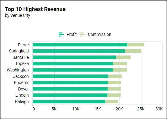
This metric identifies the most profitable cities for an event. Visualizing this data in a stacked bar chart allows for quick comparison of the revenue generated by ticket sales and how much of that was lost to commissions. This can inform future promotional budgets and tour plans.
Healthcare: Patients by specialization
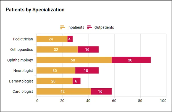
This metric tracks the number of patients treated within specific medical specialties. This helps managers of healthcare facilities understand the distribution of patient cases across various medical fields so they can allocate resources and staff effectively. Visualizing this data in a stacked bar chart provides a clear, comparative overview of patient volume per specialization and the need for beds.
Education: Education results by branch
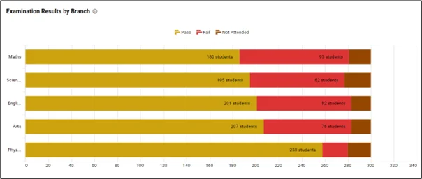
This metric provides insight into exam performance across different academic subjects, helping administrators identify areas of excellence and those needing improvement. Utilizing a stacked bar chart for this purpose allows a clear comparison of each department’s contribution to overall results, making it easier to assess and strategize for the next term.
Manufacturing: Production efficiency
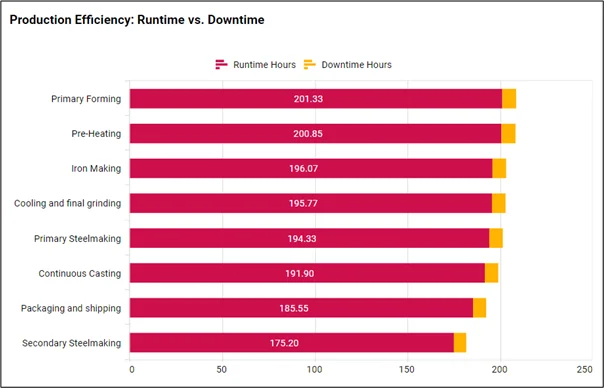
This stacked bar chart displays the stages of production and their efficiency. It shows where bottlenecks may be occurring, as the next stage waits on materials from the previous stage. It helps managers plan resource allocation and check that maintenance is being planned to minimize downtime.
HR: Employees by gender and experience
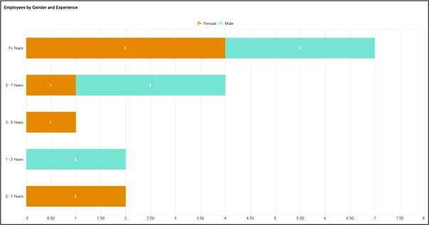
This metric aids HR in tracking workforce diversity and identifying experience gaps across genders, enabling targeted talent development and equality initiatives. Using a stacked bar chart for this metric allows for a clear comparison of gender representation within various experience levels.
Supply chain: Inventory carrying cost
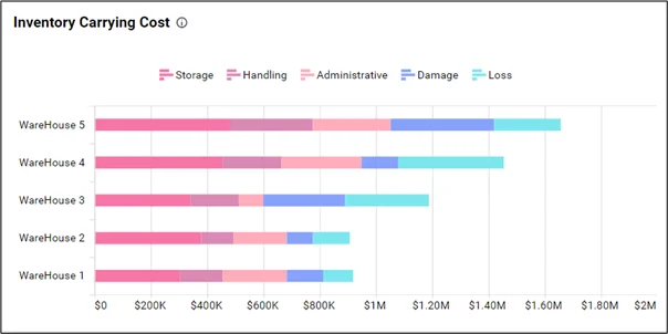
This supply chain management metric quantifies the total expense of holding stock, including warehousing, obsolescence, and capital costs, affecting profitability. Visualizing it in a stacked bar chart enables quick identification of cost components, trends, and opportunities for optimization.
In conclusion, stacked bar charts clearly visualize multiple categories within a dataset, enabling easy comparison of their contributions to the whole. Their visual simplicity and effectiveness make them valuable tools for conveying complex data relationships at a glance for precise comparison. Begin your creation today! If you’re new to Bold BI, you can sign up for a free trial on our website.


