


In data visualization, combination charts help organize and clearly display diverse data elements. These versatile tools transcend the boundaries of single-chart representations, letting viewers find hidden patterns in related datasets. This blog is your guide to merging various chart types and crafting a comprehensive visual narrative out of multiple datasets.
What is a combo chart?
A combo chart, short for combination chart, is a data visualization type where a single chart is made by combining two or more charts. This allows users to present and compare related datasets with distinct units of measurement inside the same visual space.
Importance of showcasing data in a combo chart
Comparative analysis
Combination charts make it simple to compare several factors by displaying many datasets at once. This is especially helpful for displaying relationships between two or more datasets.
Multiple scales
When dealing with datasets with different units of measurement or scales, a combo chart lets you display them clearly on the same graph.
Space efficiency
A combo chart conserves space on reports and presentations, since you don’t need to create separate charts for each dataset. This is especially beneficial when you have limited space.
Visualizing relationships
Combo charts are effective in illustrating relationships and correlations between datasets. If one dataset is affected by another, this becomes more obvious when their visualizations are overlaying each other.
Time series analysis
You can use a line chart to show trends over time and bars or columns to represent quantities at specific time points, providing a comprehensive overview of temporal patterns.
When to use a combo chart?
A combo chart is helpful when you want to:
- Compare data with different units.
- Show trends and relationships between different datasets.
- Highlight significant differences between categories.
- Combine data types like bars and lines in the same chart.
When not to use a combo chart?
Using a combo chart may not be appropriate in the following circumstances:
- When data is simple and easily visualized with one chart type.
- When data types are similar and don’t need separate emphasis.
- When comparing too many data series (clutters the chart).
Configuring combo charts in Bold BI
Check out our documentation to see how to configure a combo chart in a Bold BI®dashboard.
Key features of a combo chart
A combo chart is an effective visual for showcasing and comparing related data sets. Let’s look at some of the features of Bold BI’s combo charts.
Line style
Formatting line styles helps distinguish between different data series in a combo chart. Using distinct line types makes it clear which lines represent specific datasets, making it easier for viewers to analyze the information presented.
Trendline
Formatting trendlines in a chart serves to highlight and emphasize patterns in the underlying data. This visual aids viewers in quickly identifying and understanding the overall direction the trend is going in.
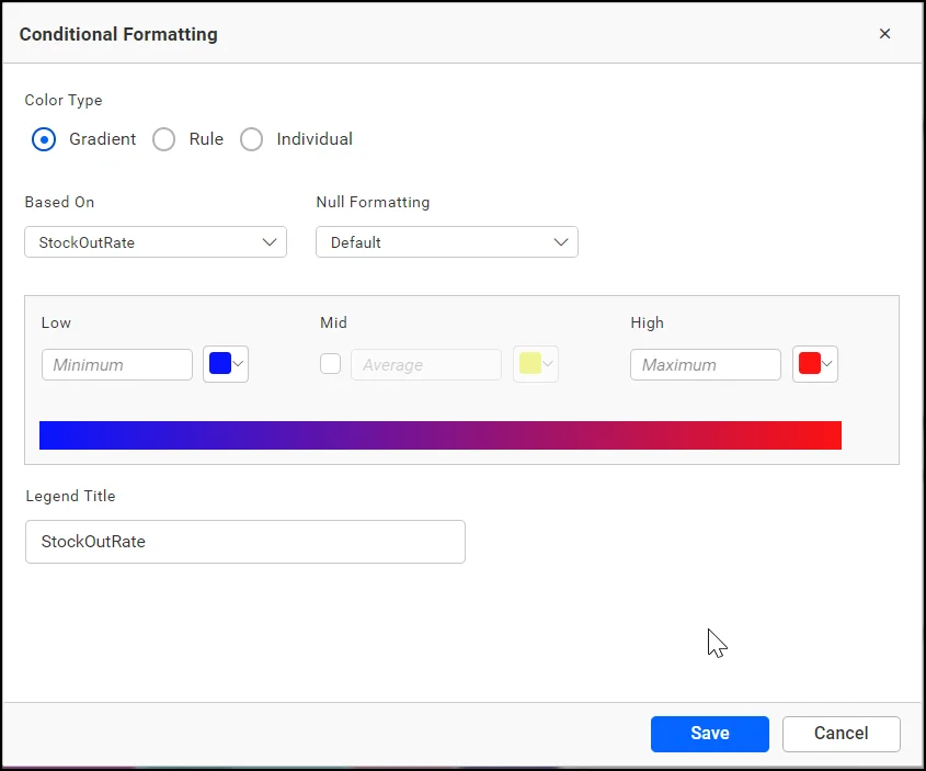
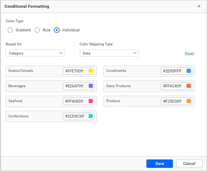
Advanced setting
In advanced settings, users can enable advanced color customization, but only for column or bar type charts. The advanced settings have three color types: gradient, rule, and individual.
Gradient
Gradient color formatting allows for the emphasis of data points by assigning varying shades, making it intuitive for users to identify values on a spectrum within the combo chart.
Rule
Rule color formatting in Bold BI combo charts is conditional styling based on specified criteria, allowing users to highlight or emphasize data points, series, or chart elements.

Individual
With individual color formatting, Bold BI combo charts empower users to customize the colors as they like, ensuring that each series is visually distinct, making it easier to interpret.

Real time applications of combo charts
Combo charts find real-time application across industries for dynamic and comprehensive data visualization. Here are some real-time applications of combo charts.
Sales
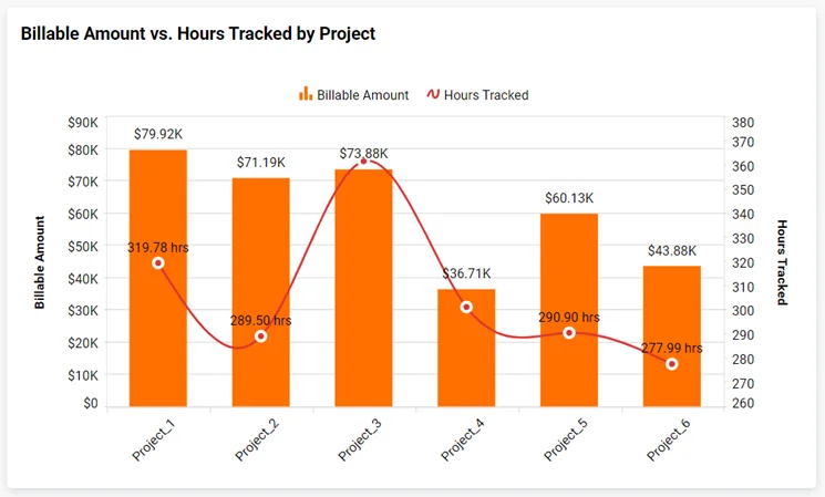
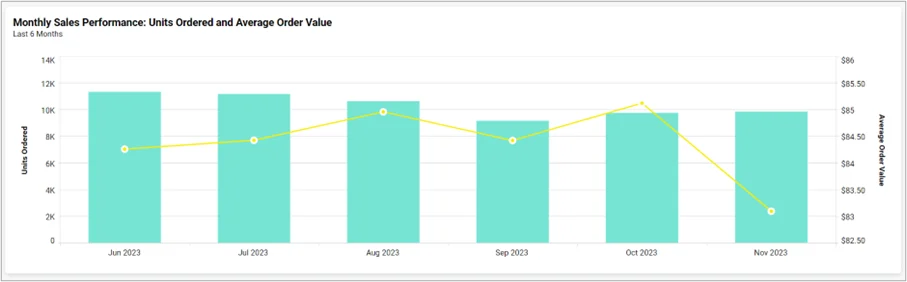
Monthly sales performance: units ordered and average order value
The sales performance is evaluated by analyzing the number of units ordered and the average order value in a month. A combo chart can provide insights into how order volume changes relate to average order value fluctuations, revealing overall sales trends and customer purchasing behavior.
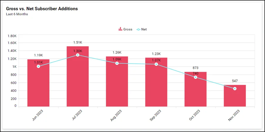
Telecommunications: gross vs. net subscriber additions
This metric measures subscriber growth in a telecommunication company by comparing gross additions and churn, resulting in net additions. A combo chart provides a comprehensive view, enabling stakeholders to understand acquisition scale and churn impact.
Insurance
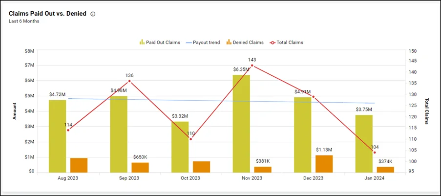
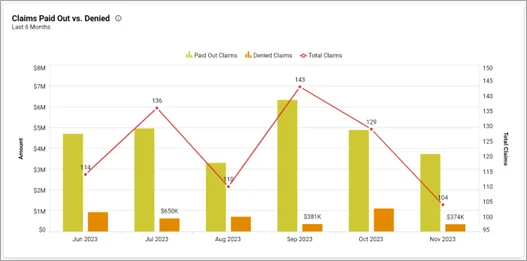
Claims paid out vs. denied
This metric compares the number of insurance claims paid out versus denied. A combo chart can visually represent the total number of claims, paid out claims, and denied claims, enabling quick assessment of overall claims status, and identifying trends.
Hospitality
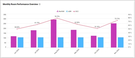
Monthly room performance overview
This metric provides an overview of how well rooms are performing monthly. Visualizing OCC alongside RevPAR and ADR in a combo chart offers a comprehensive view of hotel performance, helping stakeholders gauge demand and operational efficiency.
Bold BI®offers dynamic data visualization capabilities, and combination charts are one more excellent tool in its toolbox. Don’t just read about it—experience the transformation in your own applications by signing up for a free trial!


