


Businesses have encountered significant challenges in comprehending their data. One tool in the data visualization toolkit is the 100% stacked bar chart, which provides a dynamic and intuitive visual presentation of metrics. This visual tool excels in depicting the proportional contribution of individual components to a whole, enabling businesses to acquire insight into their data. The adoption of these charts can help provide a clear look at important metrics, so companies concerned with taking a data-driven path should take the time to understand their uses. This blog will give you more details on what a 100% stacked bar chart is and when to use it, showing you some examples along the way.
Define a 100% stacked bar chart
A 100% stacked bar chart shows bars for multiple categories, each totaling 100%. Those are then divided into segments indicating the contribution of another set of categories to the whole of each bar.
Benefits of using 100% stacked bar chart
- Visual Clarity: These charts enable easy visual comparison of subcategory contributions within wholes, highlighting data patterns and trends.
- Relative Size Analysis: They facilitate understanding of each subcategory’s proportion within each category’s total, showing how categories’ differ in their composition.
- Perspective: The charts highlight subcategory contributions to totals, instead of totals themselves, giving a different perspective on the data.
When to use a 100% stacked bar chart
- When you have categorical data.
- When you want to display two categorical variables in your data.
- For comparison across different groups.
When not to use a 100% stacked bar chart
- When dealing with data with negative values.
- When you have data with multiple dimensions.
- When you have data that lacks a clear or meaningful total.
- When you have an excessive number of categories.
Best practices to use a 100% stacked bar chart
- Understand your data: Confirm data fits a 100% stacked bar chart, ideal for comparing subcategory contributions to a total across categories or times.
- Use a consistent baseline: Ensure the starting point of a 100% stacked bar chart is 0 to facilitate comparison between category sizes for viewers.
- Color coding: Employ unique colors for each subcategory for clear distinctions. Consistent color schemes across charts enhance comprehension.
- Clear labeling: Mark each part of a bar with its corresponding value to clearly show the contribution of each subcategory. Create a legend to identify the meaning of the colors.
- Ordering and sorting: Organize categories logically, like in ascending or descending order, to simplify comparison and enhance comprehension.
- Test and iterate: Test the chart with peers for feedback before presenting or publishing and refine for clarity based on their input.
Use cases of 100% stacked bar chart
To see how to configure a 100% stacked bar chart In Bold BI®, refer to the guidelines in this documentation. Let’s look at some examples of these charts created in Bold BI.
Sales: Sales by customer segment
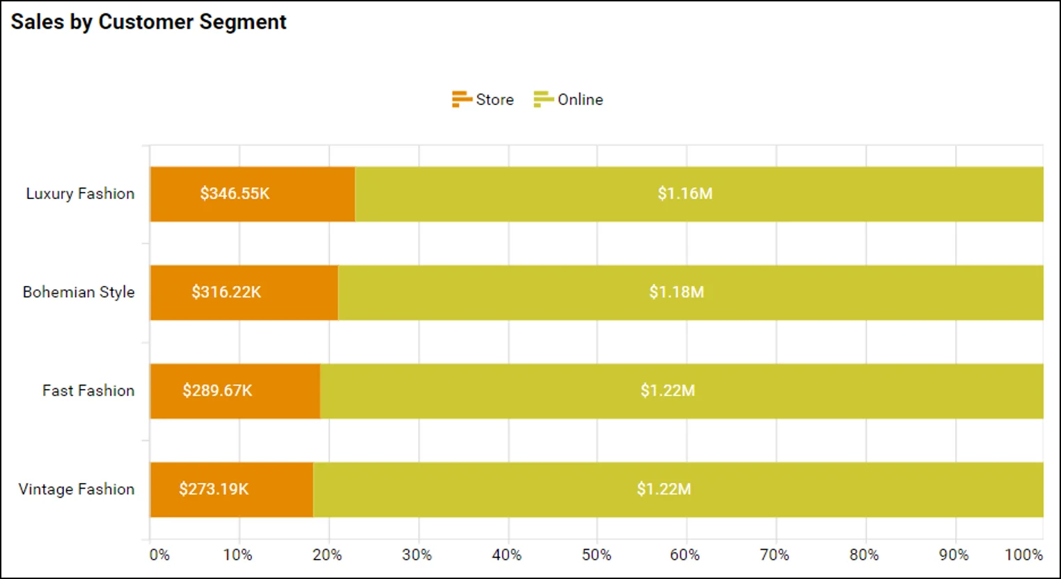
This 100% stacked bar chart from the Bold BI Sales Performance Dashboard enables sales departments to identify and compare the revenue contributions of in-person and online customers quickly, facilitating targeted strategy adjustments. It visually highlights the proportion of each group of customers within total sales for different product groups, aiding in resource allocation and market focus.
Healthcare: Patients by specialization
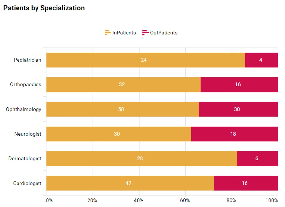
This 100% stacked bar chart from the Bold BI Hospital Management Dashboard shows the proportion of patients in each hospital department that require beds, ensuring resource allocation aligns with demand. This visualization aids in identifying trends, managing staff workloads, and improving patient care efficiency.
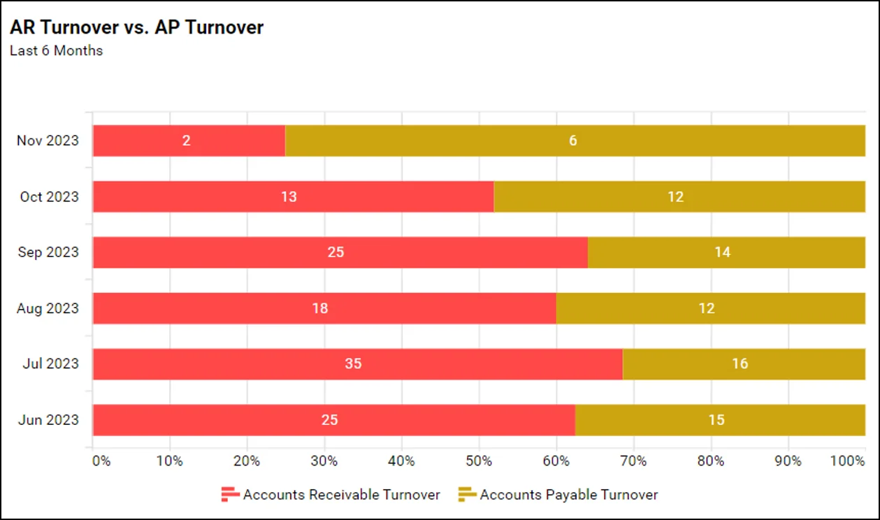
Finance: AR turnover vs. AP turnover
This AR turnover versus AP turnover widget from the Bold BI Financial Management Dashboard visually contrasts the efficiency of collecting payments versus paying liabilities, highlighting liquidity management and operational cash flow effectiveness over time in a concise format.
IT: Thread posts and replies by forum
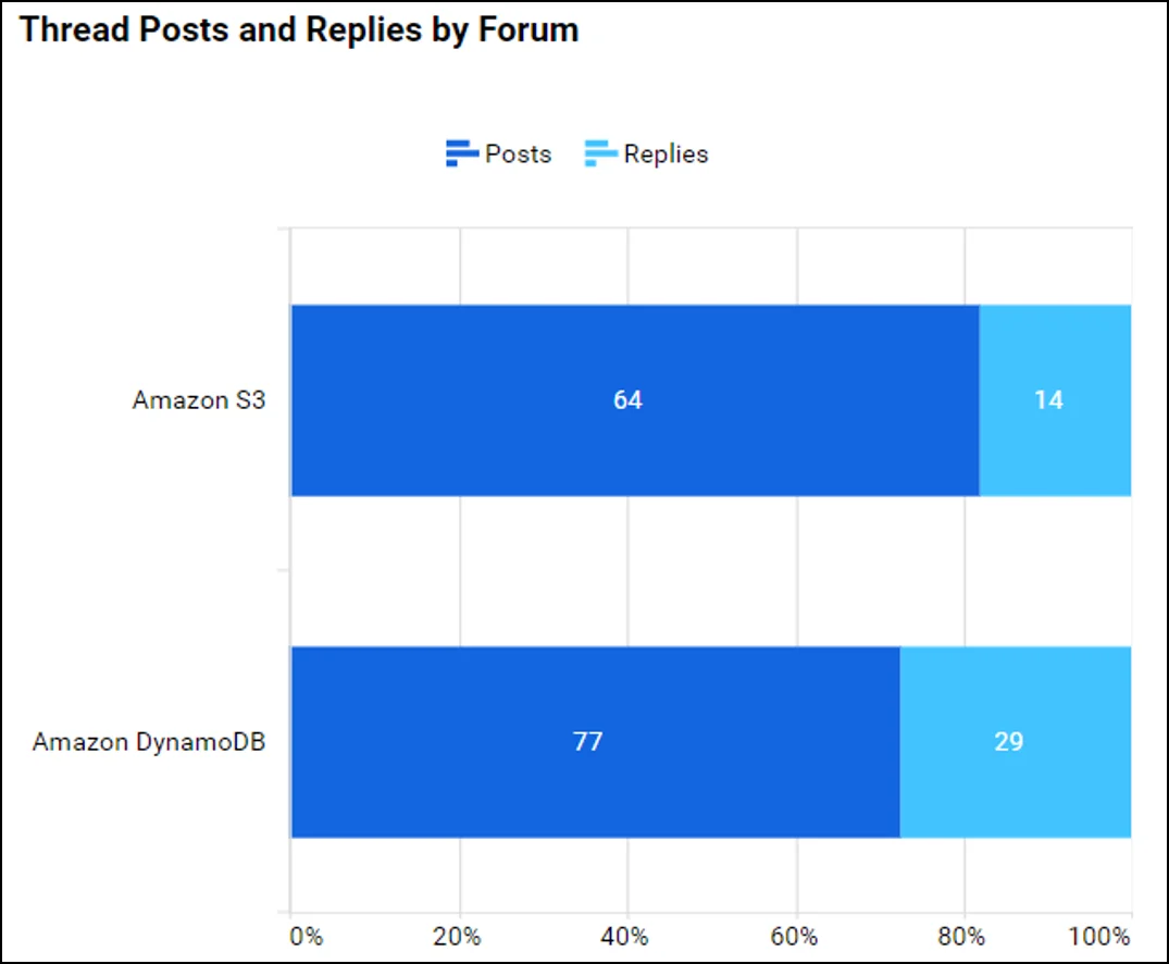
This 100% stacked bar chart from the Bold BI Amazon DynamoDB Forum Management Dashboard provide insights into employee engagement and knowledge sharing, highlighting active participation and collaboration areas. This visualization facilitates quick assessment of team interaction dynamics.
Supply chain: Inventory carrying cost
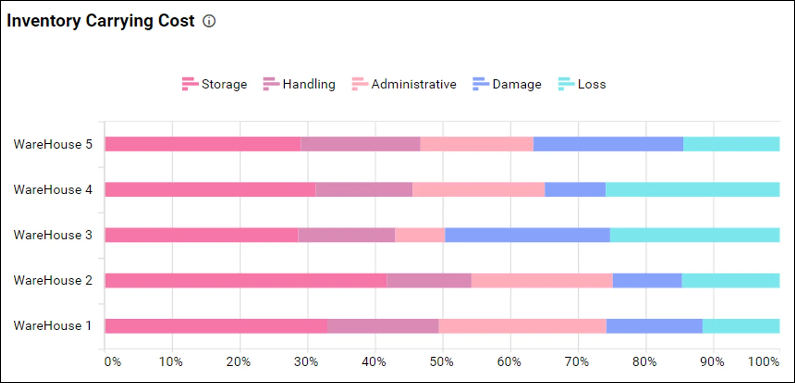
This 100% stacked bar chart from the Bold BI Supply Chain Inventory Management Dashboard shows an inventory cost breakdown, aiding in supply chain optimization and cutting excess spending.
Bold BI® enables easy creation of 100% stacked bar charts to compare the percentage distribution of subcategories in categories, providing a clear visual breakdown of proportions within the wholes. It streamlines data analysis and enhances report readability.
I hope this blog enhanced your grasp on when to use a 100% stacked bar chart, empowering you to clearly communicate proportional relationships and highlight individual contributions to totals in your data. Try creating your own for improved data visualization in your business. If you’re new to Bold BI, you can sign up for a free trial on our website.


