


With a stacked area chart, you can represent multivariate data distinctly and succinctly. This blog explores what a stacked area chart is, its significance, and how to use one. You’ll see several example charts to give you an idea of what you can do with it.
What is a stacked area chart?
A stacked area chart is a data visualization type that compares multiple measures through filled curves stacked one on another vertically. This chart is like a standard area chart but stacks the areas on top of each other instead of overlapping, making it easier to understand how each series contributes to the total sum.
Benefits of using a stacked area chart for data visualization
Clear representation of trends
Stacked area charts provide a clear visual representation of trends over time, allowing stakeholders to grasp the overall direction of data. The stacked layers illustrate the cumulative totals, making identifying fluctuations in different categories easy.
Comparative analysis
Stacked area charts are effective for comparative analysis. The stacked layers allow for a quick comparison of the contribution of each category to the total. This is particularly useful in business scenarios where understanding the relative impact of different factors is crucial.
Storytelling with data
Stacked area charts allow businesses to communicate complex narratives by illustrating how different factors contribute to an overall outcome. This aids in presenting information to diverse audiences, including those without a deep understanding of the underlying data.
Impact of variables
For metrics dealing with multiple variables, stacked area charts help understand each variable’s impact on the overall outcome. This is particularly beneficial when businesses want to analyze the combined effect of various strategies, marketing channels, or product categories.
Common understanding
Stacked area charts can be useful for cross-functional teams as they provide a view of data that is easily interpretable for members of different departments. This shared understanding can lead to more collaborative and coordinated decision-making.
When to use a stacked area chart
- To reveal both individual category trends and the collective trend of the entire dataset.
- To compare the cumulative totals of multiple variables over time.
- To illustrate the relationship between the total and its contributing subcategories.
- To visualize the proportion of each category relative to the whole and the changes in this composition over time.
When not to use a stacked area chart
- Dealing with noncategorical data or categories that don’t add up.
- When precise visibility of individual category trends is crucial, overlapping areas may obscure specific data points.
- If your dataset contains irregular or discontinuous data points.
- If the primary goal is to make precise quantitative comparisons between categories.
How to configure data to a stacked area chart in Bold BI
To configure a stacked area chart widget in Bold BI®, follow these steps:
- Find and select the Stacked Area chart from the chart options. Drag it into the Dashboard Designer.
- Click the Properties panel of the chart and navigate to the Assign Data
- Drag one or more Measures to the Value(s) field and a Dimension to the Column(s)
- Customize the chart by setting properties according to your preferences.
- Click the Preview button to see how the chart will look with your data, then save your dashboard.
See our help document for comprehensive details on customizing stacked area charts.
Applications of stacked area charts
Following are several examples of stacked area charts in use, all created in Bold BI dashboards using sample data.
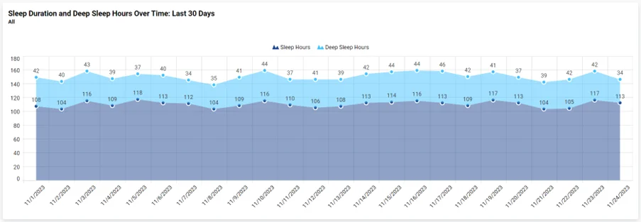
Healthcare: sleep duration and deep sleep hours over time
This chart from the Patient Health Monitoring dashboard displays the total duration of sleep and specific hours spent in deep sleep over a specific time, providing a comprehensive view of the quality and quantity of patients’ sleep.
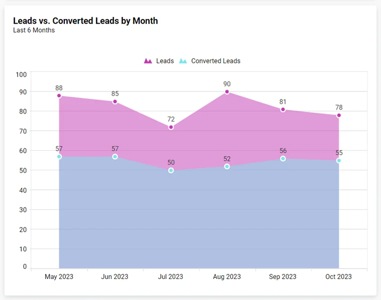
Marketing: leads vs. converted leads by month
This stacked area chart from the Salesforce Marketing Leads dashboard illustrates growth in leads and conversion rates, assessing lead conversion efficiency and sales performance. The distinct color formatting clearly depicts the series data for better understanding.
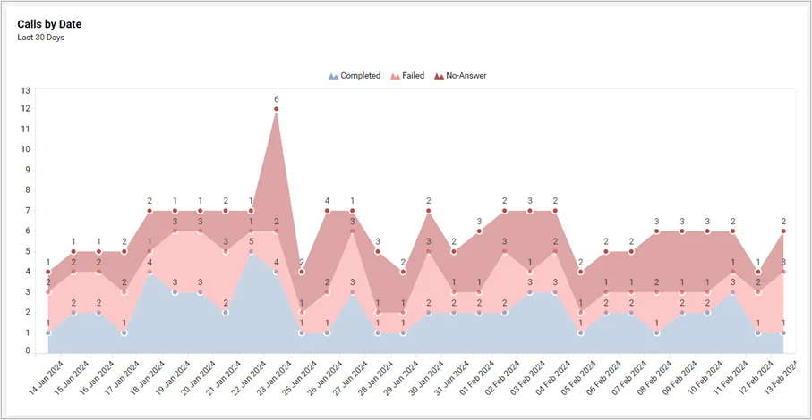
Support: calls by date
This stacked area chart from the Twilio Voice Calls and SMS Tracking Dashboard helps identify call volume and success, allowing for an understanding of potential correlations with other factors. The series color palette allows you to choose specific colors that align with your brand or visualization preferences.
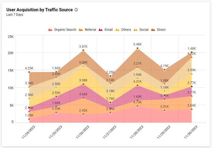
Marketing: user acquisition by traffic source
This stacked area chart from the Google Analytics Website Traffic Analysis Dashboard visualizes the cumulative impact of each traffic source over time, with different colors representing each. The interactive legend settings allow you to hide or show series data by clicking on the legend, enhancing visibility.

In summary, Bold BI® enables users to create stacked area charts effortlessly, offering a comprehensive view of data trends. These charts support informed decision-making by visually representing cumulative contributions to wholes over time, making complex data easy to understand.
If you have any questions or need assistance, don’t hesitate to reach out through the Bold BI website; simply log in to submit your inquiries if you already have an account. If you’re not yet a customer, get started with Bold BI now by signing up for a free trial!


